Of the major charting styles such as bars, lines and candles, Point and Figure is unique in that it is constructed in a completely different way from the others but is analyzed with the same techniques. It plots price changes only, without regard to time, through a user defined filter. This filter removes price “wiggles” (volatility) and can be adjusted for maximum or minimum sensitivity.
Traders constructed point and figure charts by hand, before the advent of computers, partly because they could not plot each tick and continue to trade. By applying the filter, they only had to plot significant changes in market direction which occur less frequently.
Point and Figure Chart Construction
The components of the chart are the box and the reversal length. A box contains a user designated number of change units. For example, a box size of one for USH4 (March CBT US Treasury Bonds) would be 1/32. A box size of one for the US Dollar-French Franc would be .0001 and for Knight-Ridder stock would be 1/8.

Let’s say Knight-Ridder trades at 58 and then at 58 1/8. Two boxes would be plotted on the chart. If the box size were two, then only one box, encompassing both prices, would be drawn.
If prices are rising, the boxes are designated by the letter “X”. If prices are falling, the box would then be designated by the letter “O”. Columns of “X” and “O” are built as the market trades higher and lower, respectively. For a rising market, each time prices trade up to the next box level, an “X” is added to the current column of “Xs”. For Knight-Ridder stock with a box size of two, there would be an “X” at 58. When price moves up to 58 1/4 (two change units higher), another “X” would be added to the top of the column.
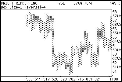
Figure 1
Since markets don’t only go up, prices will eventually trade lower. A reversal occurs when prices fall by a user defined number of boxes. For example (see Figure 1), if the box size is two and the reversal size is four it means that Knight-Ridder must trade lower (from the top of the column of “X”) by 1 full point. This is derived from the change unit of 1/8 times the box size of two times the reversal size of four. When a reversal occurs, a new column of letters is started to the right of the current column. In this example, a column of “Os” will be added.
The larger the box and the larger the reversal, the larger the filter imposed on prices. Typically, the box size is set for each specific type of instrument. For example, US stocks trading over $20 use a box size of 1 point, stocks less than that use 1/2 point and US Treasury bonds use 1/32.
The reversal size is changed to adjust the sensitivity of the analysis. The larger the reversal, the less likely the analysis will be affected by whipsaws and volatility. The smaller the reversal, the more sensitive and detailed it will be. Since point and figure is calculated from tick data, a medium to long term analysis will be better using a larger reversal and a short term analysis will be better using a smaller reversal. Point and Figure can also be calculated using daily data and this is usually done for long term analysis since the intraday reversals are lost.
Interpreting the Chart
Point and Figure charts are analyzed like bar charts using trendlines and other technical patterns. Such features as gaps and one-day reversals are not available but the charts reveal other conditions not readily seen in bar charts. Figure 2 shows the February 1994 COMEX Gold contract in a tick chart format. Figure 3 shows the same data set in a 1 by 5 point and figure chart (box=1 and reversal=5, change unit =.1). Note that the general shapes are the same but there are two flat and wide zones at 375 and 377 in the point and figure chart. What wasn’t readily visible in the tick chart was the fact that for two small periods of time, the market was very volatile, showing several reversals in succession. The wider the point and figure pattern, the more significant it becomes. In this case, the 375 area provided strong intraday support and the 377 area showed a strong resistance to the rally. These two zones are labeled in both charts as “A” and “B respectively.
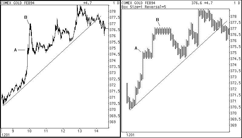
Figures 2 and 3
One of the philosophies of technical analysis is to make decisions based on several indicators. For example, when trend breaks, high volume and extreme oscillator values coincide, the signal is stronger than any one indicator alone. Point and figure provides another dimension to the analysis by looking at price without time, and should become part of your analytical toolkit.
Leave a Reply
You must be logged in to post a comment.