POINT AND FIGURE FUNDAMENTALS
Many investors are familiar with charts of some kind or other, whether from school or reading newspapers or magazines. Point and Figure charts were developed over 100 years ago and have stood the test of time. We’ve even added a new dimension to the history of their effectiveness in negotiating all markets. That new dimension is the Internet craze. The Internet has allowed us to deliver our charting system to anyone in the world who has Inter- net service. The major leaps in computer technology have al- lowed us to create some amazing indicators that only 10 years ago were not possible. When I say they have withstood the test of time, I mean right up through today in this third edition of Point and Figure Charting. And, I’m even more confident now about this method than I have ever been.
I have taught this method of technical analysis in many semi- nars and classes. I have even taught it to schoolchildren as young as 12 years old. One reason this methodology is so teachable is that it is based on supply and demand. The irrefutable law of sup- ply and demand governs the movement of prices in stock, or any- thing else for that matter. If there are more buyers than sellers willing to sell, prices rise; on the other hand, when there are more sellers than buyers willing to buy, prices decline. These imbal- ances in supply and demand, and nothing else, cause prices of stocks to move up and down. When you cut through all the red tape and obfuscation on Wall Street, you are left with the raw
21

22 Learn the Point and Figure Methodology
facts of supply and demand. Fundamental changes in the underly- ing company’s outlook can cause this imbalance, but it is the im- balance nonetheless that causes the stock to move. Don’t get me wrong. I am not saying fundamental analysis is not important: It is the first line of defense. I want any stock I buy to be fundamen- tally sound. I love to start with a list of fundamentally sound stocks before I begin to evaluate the supply-and-demand relation- ship of the stocks. Keep that firmly in mind as we go forward. The problem with fundamentals is they change ever so slightly early on and this change is rarely picked up on the fundamental ana- lyst’s radar screen. The investors who truly understand these nu- ances begin to cast their vote on the stock early on and this causes the supply demand relationship to change. This change is then picked up on a Point and Figure chart, which in turn tips off the astute investor of an imminent change in the underlying stock’s direction. All too often, fundamental analysts say they missed the decline in the stock because the businesses of the companies they followed were not failing. Until the underlying business begins to change, they cannot change their opinion, and rightfully so. Their expertise is evaluating the fundamentals of the underlying stock, not its supply/demand relationship.
The Point and Figure method of analyzing stock movement was designed simply as a logical, organized way of recording this battle between supply and demand. The word organized is the key. A basic road atlas would be difficult to use if the actual lines depicting the roads and interstates were missing. It is the same in the stock market business. Looking at an endless list of High- Low-Close quotations on any particular stock can be equally con- fusing. When these quotations are organized in a logical fashion, however, the battle between supply and demand becomes much more evident. The Point and Figure chart simply shows whether supply or demand is winning the battle. We use various chart pat- terns and trend lines to guide our buy-and-sell decisions. These patterns are covered in detail in later chapters, as is market and sector analysis.
A tennis match is a helpful analogy in describing this battle between supply and demand. Consider a match between tennis greats, Jimmy Connors and John McEnroe. Let’s call demand
Point and Figure Fundamentals 23
Jimmy Connors and supply John McEnroe. Their tennis match consists of various sets. The sets in this tennis match are similar to the Point and Figure chart moving back and forth, changing columns of alternating X’s and O’s. This seemingly random move- ment in the Point and Figure chart is similar to the seemingly random changes in sets the players win during the tennis match. Eventually, Connors or McEnroe wins enough sets to emerge vic- torious in the match. Likewise, only when the match between supply and demand is completed can we get a handle on which way the stock is likely to move. The Point and Figure chart con- siders the sets that are played as market noise and not worthy of inclusion in the decision-making process. In the short run, stock prices move about randomly but eventually demand or supply takes control and a trend begins. In this book, I refer to tennis and football in explaining many of the market indicators and stock chart patterns you are about to learn. Let’s play ball!
The Basic Tenets of a Point and Figure Chart
We begin with the basics of maintaining your own chart. We use plotting a stock as our basis for explaining how to chart and then end the chapter with some of the nuisances of charting mutual funds and Exchange Traded Funds (ETFs) but the fundamentals are the same for all investment vehicles—from stocks to funds to commodities, and so on. It only takes a few minutes each day to update 20 or 30 charts by hand but why bother when we have a web site that does all the work for you on over 8,000 stocks a day? It does help in gaining a strong feeling for the process if you main- tain a few by hand each day. We have a broker client who updates over 400 each day by hand and would never give up that process no matter what. At Dorsey, Wright, & Associates (DWA), posi- tions in our managed accounts and key indicators are charted by hand each day. It gives a feel that one cannot get any other way. Most investors, however, don’t have that time available after mar- ket hours, and thus the Internet is a valuable time-saver. If you should choose to maintain charts by hand, all you would need is a financial page providing the high and low prices of stocks each
24 Learn the Point and Figure Methodology
day. If you have a computer with Internet hookup, you will be in technical analysis heaven these days.
The Point and Figure chart uses only the price action of the stock—volume is not a consideration. Volume will have to show up in the chart patterns because there will be no movement of the stock unless there are more buyers than sellers willing to sell or more sellers than buyers willing to buy. Much of the volume in stocks today is related to option strategies and hedge fund activi- ties that have nothing to do with a bet on the direction of the stock. You would be amazed at how much is just option related. Remember, we are only interested in the battle between supply and demand. Two letters of the alphabet are used in this method of charting, “X” and “O.” The X represents demand. The O repre- sents supply. The key to this method is how the chart moves from one column to the next. For the purposes of this book, we will use the 3-point reversal method. As you become more adept, you may want to choose other reversal points. At my company, however, we never deviate from the three-box method described in this sec- tion: We keep it simple. Figure 2.1 shows a basic chart that gives you an idea of what the Point and Figure chart looks like. Talking about the X and O reminds me of a seminar I held in Minneapolis one day. A beautiful woman in her 70s came up to me after the seminar and told me how her husband had gained new vigor and enthusiasm for life now that he charted all their stocks every day. (They had attended two other seminars I had held in Minnesota and had read my book.) She went on to tell me how she also helped him manage their considerable portfolio. She said with a
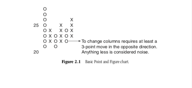
Figure 2.1 Basic Point and Figure chart.
Point and Figure Fundamentals 25
smile, “He handles the hugs and I handle the kisses.” What a wonderful story! I could, in fact, write a book devoted to stories of people who became successful investors when they embraced this operating system. It makes me feel especially good when learning this method changes a professional investment advisor’s life. This simply means he or she is helping many other people become successful with their investment endeavors. Today, re- tirement is on many people’s minds. According to the Census Bu- reau, over three-quarters of all the wealth in the United States is in the hands of those of us who are over 50 years old.
The chart pattern is formed by alternating columns of X’s and O’s. The only way a column of X’s can change to a column of O’s is by reversing three boxes. The same three-box reversal method applies to the column of O’s. This moving back and forth from one column to the next is what causes the chart pattern to form. This is where the Point and Figure chart drastically departs from the method of the bar chart. The Point and Figure chart leaves volatility out of the equation and gives you a clear picture of the battle between supply and demand. The bar chart on the other hand includes volatility in the equation because the chart must be updated every day no matter how inconsequential the move might be. This is why bar charts are subjective and difficult to read, and are rarely effective for many people who use them.
Let’s get into the mechanics of charting by looking at the val- ues of the boxes we primarily use in constructing the chart. When I say box sizes, I mean the boxes on a simple sheet of chart paper. You know the paper; the same charting paper you use to get in Bi- ology class in High School. The box sizes change as the stock price moves through certain levels. This is why we call this method a three-box reversal method rather than a 3-point reversal method. It is important to think in terms of boxes rather than prices. Between 20 and 100, the box size is 1 point per box. If a stock is trading below 20 or above 100, we use other box sizes. Simply stated, when a stock is between 0 and 5, the box size on the chart is 1⁄4 of a point. Between 5 and 20, the box size moves up to 1⁄2 point per box. Between 20 and 100, the box size is 1 point per box. Above 100, the box size rises to 2 points per box. Finally, above 200, the box size is 4 points per box. Keep the following table handy while you are learning to chart:
26 Learn the Point and Figure Methodology
Price ($)
0 to 5
5 to 20
20 to 100 100 to 200 Above 200
Box Size
1⁄4 point per box 1⁄2 point per box 1 point per box 2 points per box 4 points per box
The Internet age ushered in higher priced stocks and, more importantly, more volatility. After the Internet bust, energy stocks and metals stocks became the high fliers. One of the best ways to adjust for that volatility is to increase the box size. Many stocks in the technology and Internet sectors were so volatile that we had to increase the box size enough to compress the chart and obtain a normal picture of the supply and demand relationship of the stock. In fact, stocks like Yahoo in 1998 to 2000 often required 10 points per box to compress the chart to normal. And, these Internet stocks and high-tech/high-wreck stocks absolutely wiped out many investors in 2000. Think about this for a second. If we have to increase the box size from, let’s say, 1 to 5 to slow the chart down enough to get a good pic- ture of supply and demand, this stock is too volatile for most in- vestors. Many investors saw stocks drop 50 percent or more in a single second in 2000. Apple Computer, for example, reported less than expected earnings for the quarter. Wham! The stock was down 50 percent on the opening. This is important: As you embark on your investment endeavors, remember that stocks with 5-point box sizes are out of the realm of most investors’ risk tolerance. If you find it compelling to invest in these stocks, buy 10 shares. This will help you slay that monster called volatility. On our web site, we have a system called “Smart Charts.” These charts give the user the ability to raise or lower the box size on any chart. This can give the chart user some per- spective when making a buy or sell decision on that stock. Often, we will gravitate to a smaller box size on a stock to help in establishing a less painful stop loss point. We have come a long way on our web site (www.dorseywright.com) since its debut in 1994 when we were one of the first to use the Internet as a delivery system.
Point and Figure Fundamentals 27
Let’s go over these different box size values once again. I want this to be set firmly in your mind. If a stock were trading below 5, then each box would have a value of 1⁄4 point. Between 5 and 20, the box size would be 1⁄2 point. If the stock were trad- ing between 20 and 100 (where most stocks trade), the box size would be 1 point. If the stock were trading at 100 or higher, the box size would be 2 points; and above 200, the box size would be 4 points. Again, these are the standards or the “default” box sizes. The beauty of the system is you have control of what you want the box size to be. Some stocks are high dividend payers and have very low volatility. The standard box sizes might not be right for these stocks and thus require a smaller box size. As I mentioned, you can make changes on our system. The key to making the chart relates to how the chart switches from one column to another. When a stock is rising and demand is in control, the chart will be in X’s. Conversely, when a stock is de- clining and supply is in control, the chart will be in O’s. It re- quires a three-box reversal or more to be significant enough to warrant changing columns. Therefore, to change columns from X’s to O’s when the stock was between 20 and 100 would re- quire 3 points. We established that between 20 and 100 the box size was 1, so three boxes equals 3. The same three-box reversal would only be 11⁄2 points if the stock were between 5 and 20. If the stock were trading below 5, the same three-box reversal would only be 3⁄4 of a point because the box size in a stock be- tween 0 and 5 is 1⁄4 of a point. Think in terms of box reversals.
Figure 2.1 illustrates how much the stock must rise or fall to create a reversal on the chart. In this chart, each column has at least three X’s or three O’s, maybe more, but never less. Although I am being redundant, that’s okay—I intend to be redundant in this chapter to help you catch on to the basics of maintaining your own chart. The rest of the book will flow easily once you un- derstand this concept. If you don’t catch on after the first reading, go back and reread this chapter again and again until you are com- fortable with the concepts. Believe me; it will be worth your time. When you become a craftsman at this easy method, you will join an elite group of investors and professionals who consistently make money and manage risk with this method. I call them The SEAL Team of Wall Street.
28 Learn the Point and Figure Methodology
IF THE CHART IS FALLING IN A COLUMN OF O’S Yes
No
Check the Daily Low Did it fall?
Put in the appropriate boxes.
Does the stock reverse up on its chart?
Move over one column and up one box and place the X’s in the boxes to the appropriate place.
Move on to the next chart!
No
Yes
Yes
Figure 2.2 The flowchart for charting; explains charting process. Updating a Point and Figure Chart
When I lecture on this subject, I use the flowchart shown in Fig- ure 2.2 to demonstrate how to update a chart. The basic concept is as follows. Whichever column the chart is in, you will remain in that column as long as the stock continues in that direction by one box or more. Let’s stop and think about that statement for a second: “As long as the stock continues in that direction by one box or more.” So, if the chart were in a column of O’s and declin- ing, your first question of the flowchart at the close of the busi- ness day would be, “Did the stock decline one full box or more on the chart?” If the stock did decline one more box, let’s say from 45 to 44, then record that move by making an O in the 44 box and stop—go no further that day. Keep in mind; all you are doing is recording what the stock does on each trading day, noth- ing more, nothing less. Don’t think about the chart again until the close of business the following day. At the close of business the following day, you simply look at the high and low for the day (in the case we are now discussing, the low would be the most important) and ask the same question again. Since the
Point and Figure Fundamentals 29
stock is still in a column of O’s, did it decline another box or more? Answer the question by looking at the low price for the day. If the stock in this case hit 43 or lower (declined one more box or lower), record the move by making an O in the box and stop. I don’t care if the stock reversed later in the day and went to 100. You’ll deal with that move tomorrow. You are only con- cerned with one direction per day. At this point, the stock is at 43 in a column of O’s. Since the stock is still in a column of O’s, the next day at the close of trading you ask the same question again. Did the stock decline one more box or lower? Today, the answer is no to flowchart question 1. The stock did not move lower by one box or more today.
Because the stock did not decline enough to close one more box today, you go to the second and last flowchart question. Since the stock did not decline any further, or at least enough to close another box, the second and final question of the flowchart is, did the stock reverse up three boxes? Let’s think about this for a sec- ond. Did the stock reverse up three boxes? In this example, we are discussing a stock that is trading between 20 and 100 so the box size is 1 point per box. So, a three-box reversal up would be 3 points higher than the last “O.” Count up three boxes from 43, which would be 44, 45, and 46. Okay, did the stock hit 46? Let’s say it hit 45.75. That’s not good enough. That was only a 2.75 re- versal, not 3. What do you do? Nothing.
The next day, you go through the same process again. Since the stock is still in a column of O’s, the first flowchart ques- tion that must be answered is, “Did the stock go down one box or more?” Get the picture? You go back to the first flowchart question and start again. At this point, there can only be two action points on the chart. The stock either does move one more box lower or it reverses up three boxes. The two action points that will cause me to make a mark on the chart are 42 or 46. Nothing else will cause a change on the chart. It either con- tinues in its current column of “O’s” or it reverses up into a column of “X’s.” That is about as difficult as it gets in main- taining a Point and Figure chart. Okay, back to the example, if over time, the stock does reverse up three boxes to 46 by following these two flowchart questions, you will find the chart now one column over to the right and that movement
30 Learn the Point and Figure Methodology
represented by three X’s. The chart is now rising. The same process starts over again, only this time the first flowchart question is, “Did the stock move up one box or more?” That is really the whole ball of wax.
Once again, it takes three boxes to reverse from one direction to the other. For example, if a stock were trading in a column of X’s with a top of 45, it would take a move to 42 to reverse this chart to a column of O’s: 45−3 = 42. Anything less than three boxes would be considered market noise, not worthy of recording. Conversely, if the stock in question was trading in a column of O’s with a current low at 45, it would need a rise to 48 before a re- versal into a column of X’s could be recorded; as before, anything less than three boxes would be considered market noise. Figure 2.3 shows some examples of reversals.
There is one exception to the preceding pattern. If a stock reversed from 21, for example, the required number of points would only be 2. This is because the stock will be moving through a level, where the box size changes. If a stock is moving up (in a column of X’s) through the upper teens and has a high of 21, a reversal would take place at 19, a move of only 2 points. The three boxes in this case are at 20; then as the stock goes below 20, the box size changes to 1⁄2 point per box or 191⁄2, 19, and so on. Once again, the box size between 20 and 5 is 1⁄2 point per box rather than the 1 point per box above 20. Keep break points in mind when you are charting at levels where the box size changes. If you just price the vertical axes properly, you need deal only with the boxes. Prices will take care of them- selves. Keep it simple. Just assign the proper point value to the box, 1⁄2, 1, and so on and then count three boxes. This brings you to the actual charting. The daily high and low quotations for a stock are all that you will need. In today’s Internet world,
Figure 2.3 Examples of reversals.
Point and Figure Fundamentals 31
all you need do is go to our web site and we do all the work for you. If you choose to do it by hand, most newspapers have a fi- nancial section, but quotes are limited. Sites like Yahoo Fi- nance would serve your quote needs perfectly. Once you have the quotes, the only prices you are concerned with are those that cause changes in the chart. For example, a stock is in a col- umn of X’s and has a high of 28.875. For charting purposes, we would read this as 28 because between 20 and 100 there are no fractions in the boxes. Each box is 1 point. In this case, .875 is not enough to close the box of 29. It’s .125 too low. To the Point and Figure chartist, .875 is simply market noise when the box size is 1 point. If a stock is in a column of O’s, you are primarily interested in whether the stock declined on that day of trading and you would look at a stock’s low first. Using the same exam- ple, a stock has a low of 28.875. You read this as a low of 29. The stock must move to 28 to add another O to the chart. When you get a reversal of three or more boxes on a chart, you plot the reversal one column over and three boxes up or down depending on the direction of the reversal. The first change in direction would always be a three-box move because that is the mini- mum move required to shift columns. After the shift in columns, the moves could be as low as one box. If the stock re- verses down, you will plot an O one column over and three boxes down. If the stock reverses to the upside, you will plot an X one column over and three boxes higher. When reversing up or down, your count does not begin at the last number. Up means begin counting up one box. For example, to begin count- ing a reversal up where the last box closed at say, 28 with an O, start counting up at 29, 30, 31. The first X of the three-box re- versal up would begin at 29. A reversal down suggests you begin counting down one box below the highest X.
The only record of time in the Point and Figure chart is the replacing of the X or O with the number of the month when the chartist makes the first entry of that month. Placing the month in the chart has no significance except as a reference point. As the stock moves about, it alternates back and forth from one column to the next, X to O, O to X, and so on. At no time will you have an O in a column of X’s nor an X in a column of O’s. As previously mentioned, the first action point on the chart in
32 Learn the Point and Figure Methodology
any given month is represented by the number of the month. For example, if a stock rises one box, you would add another X to its chart, but if that X, or plot, is the first one for July, you would use a 7 instead of an X in that box. Seven signifies the seventh month of the year, or July. This also holds true on down moves. For example, if a stock declined one box, and that is the first action point in August, you would put an 8 in the box in- stead of an O.
Let’s cover it again. If the chart is rising, first check the daily high, and add an X if the stock has risen enough to close the next open box or boxes. You would add as many X’s as needed to rep- resent the stock’s move. If the stock rose 4 points during the trading session, and each box equaled 1, you would put four X’s on the chart. If the same stock moved up 5 points, you would add five X’s. Flowchart question 1 would have been satisfied and at that point you stop charting for that day. If, on the other hand, the stock did not move high enough to add another X, you go to flowchart question 2 and check the daily low to see if it has de- clined enough (3 boxes) to reverse on the chart. The reversal is the key feature of the Point and Figure chart. If it did reverse, move one column over and one box down, then add the three O’s representing the reversal. If the stock did not decline enough to warrant a reversal, then there is no action on the chart for the day. Remember, the three-box reversal means all three boxes must be filled before you fill any of them (2.99 points is not 3, and 3 is the requirement for a reversal if the point value of a box is 1). You cannot begin filling one box, then the next, until you get three. The chart will remain in its current column until it closes (hits) all three boxes on the reversal. I am being purposely redundant because it is incredibly important that you under- stand the concept of charting before we go on to the fun parts of the book.
By using a three-box reversal method, we eliminate the minor moves that often occur in the market and look for moves that are significant enough to warrant representation. If a stock is declining, use the same process in reverse. Look first to see if the stock has moved down enough to add another O. If it has, add the O or O’s. If the stock did not decline enough to close another box, then look at the daily high to see if the stock has rallied
Point and Figure Fundamentals 33
enough to reverse the chart up. If it has, move one column over and one box up and add the three new X’s. If it has not moved up enough to reverse, there is no action on that chart for the day. Some stocks can sit for months without any change. In volatile markets, the chart could continue in its present direction and then reverse. In other words, the stock rose enough to close an- other box with an X, but the last 20 minutes of trading that day, the stock declined 8 points on earnings news. You would simply stick to the flowchart, close the box with an X and forget the re- versal at the end of the day. Remember, one direction per day. You will deal with that reversal tomorrow. It is a good idea to be aware of the stock’s reversal at the end of the trading session, even though you don’t record it on the chart that day. This can happen when earnings reports are released. The stock rises one box on the day, but late in the session the earnings are released. Let’s say they are much less than Wall Street expected. This could have the effect of immediately collapsing the stock price, thus producing what might seem like a reversal back down the chart. Remember, as I mentioned earlier, a chart can only move in one direction a day. In this case, you update the chart by mov- ing it up in the column of X’s. If the stock has moved enough late in the day to reverse, you will more than likely chart that rever- sal the following day, but not in all cases.
If you have already gotten the hang of updating your chart, you can move along to the next section; if not, let’s recap for a moment. We’ll call it Study Hall. If a stock is rising in a column of X’s, you will record any subsequent up-moves as long as that up-move equals or exceeds the next highest box. If the stock does not move up enough to equal the next higher box, then you look to the low to see if the stock reversed columns. To reverse into a column of O’s from X’s, the underlying stock must reverse three boxes to be significant enough to warrant a change in columns. Thus, the action points in a stock that is rising and has the 50 box closed with an X will be 51 for another X, or 47 to qualify for a re- versal into a column of O’s. The opposite is true for a stock de- clining. The easiest way to chart is to determine your two action points before you seek the high and low for the day. In the preced- ing example, your action points were 51 or 47. That’s all you look for in the high and low for the day. Did the stock hit 51? If the
34 Learn the Point and Figure Methodology
answer is no, then did it hit 47? If one of those action points was hit, record the correct price and stop. Once you understand the concept of the reversal, you have mastered the nuts and bolts of this method. I urge you to keep studying this method. It will truly change your investment life. Sometimes we feel as if we are falling behind or failing when we try something new. Keep at it. I like to think about Thomas Edison, who failed many times before he found the right path.
Edison’s life is a prime example of the American Dream. Without question, he was a giant among men. During his life- time, he patented a record 1,093 inventions. Some of those in- ventions literally revolutionized the world. However, despite having one of the greatest minds in history, Edison, like all men, knew failure. In fact, he failed quite often. But like all great men, Edison accepted failure as a learning experience that would help him grow and develop. His son Charles Edison wrote about his father: “It is sometimes asked—didn’t he ever fail? The answer is yes.” Thomas Edison knew failure frequently. His first patent, when he was all but penniless, was for an electric vote recorder, but maneuver-minded legislators refused to buy it. Once he had his entire fortune tied up in machinery for a magnetic separation device for low-grade iron ore only to have it made obsolete and uneconomic by the opening of the rich Mesabi Range. But he never hesitated out of fear of failure. “Shucks,” he told a discouraged coworker during one trying se- ries of experiments. “We haven’t failed. We now know a thou- sand things that won’t work, so we’re that much closer to finding what will.” If you are reading this book, you are on your way to becoming a world-class investor by learning what works. Now it’s time to take what you have learned and construct a Point and Figure chart based on a series of highs and lows. In Figure 2.4 we have provided you with a piece of graph paper to plot your practice Point and Figure chart. Using the data in Fig- ure 2.5 and using the principles you just learned about charting and using the simple two-question flow chart as your guide, plot a Point and Figure chart. As you plot this chart, remember that you are recording the supply-and-demand relationship of the stock in a logical, organized manner.
Point and Figure Fundamentals 35
25
20
19
18
17
O
O
O
O
O
O
O
O
O
O
O
X
X
X
O
O
O
O
X
X
O
X
X
X
X
X
X
X
X
O
O
O
O
O
O
O
X
X
X
O
O
4
16
O
O
X
O
X
O
3
O
Chart update begins
April 20
Figure 2.4 ABC Corp. starting chart.
Practice Chart: ABC Corporation
We have used the price quotations shown in Figure 2.5 to con- struct the chart that appears in Figure 2.6. Take a look at that chart now. Notice how the last box closed in the chart in April is at the price of 16. We begin updating the chart from that point. Remember the easiest way to maintain a Point and Figure chart is to determine where your action points are. If the chart is in a col- umn of O’s, the first action point would be one box lower than the last one recorded. If the stock does not decline low enough to record the lower box, then your second and last action point would be a three-box reversal up. In the case of ABC Corporation, the first action points from the bottom at 16 in April would be 151⁄2 (one box lower) or 171⁄2 (a three-box reversal up). From the 16 level, there are no other action points. Whichever action point is hit first, record it, and then determine your next action point. That basically is all there is to updating a chart. Always think of your two action points.
DATE
20-Apr
21-Apr
22-Apr
25-Apr
26-Apr
27-Apr
28-Apr
29-Apr
2-May
3-May
4-May
5-May
6-May
9-May
10-May
11-May
12-May
13-May
16-May
17-May
18-May
19-May
20-May
23-May
24-May
25-May
26-May
27-May
31-May
1-Jun
2-Jun
HIGH
16.625
16.250
16.875
16.750
17.375
17.375
18.125
18.125
18.375
18.250
18.250
18.250
17.750
17.750
17.625
17.625
17.500
17.500
17.375
17.500
17.625
17.625
17.625
18.000
18.875
19.625
19.750
19.125
19.375
22.250
20.500
LOW
16.000
16.000
16.375
16.500
16.500
17.375
17.500
17.625
17.500
17.875
17.875
17.500
17.500
17.125
17.125
17.125
17.125
17.125
17.125
17.125
17.250
17.375
17.250
17.500
17.625
18.625
18.375
18.500
18.875
19.625
19.500
LAST
16.000
16.125
16.625
16.625
17.375
17.375
17.750
17.625
18.000
18.000
18.125
17.500
17.625
17.125
17.125
17.375
17.250
17.375
17.250
17.250
17.375
17.500
17.375
17.625
18.875
18.875
18.500
18.875
19.000
21.750
19.750
DATE
3-Jun
6-Jun
7-Jun
8-Jun
9-Jun
10-Jun
13-Jun
14-Jun
15-Jun
16-Jun
17-Jun
20-Jun
21-Jun
22-Jun
23-Jun
24-Jun
27-Jun
28-Jun
29-Jun
30-Jun
1-Jul
5-Jul
6-Jul
7-Jul
8-Jul
11-Jul
12-Jul
13-Jul
14-Jul
15-Jul
HIGH
21.000
21.750
21.500
21.125
20.750
21.625
23.125
23.250
22.875
24.250
24.625
23.250
23.125
22.250
21.625
21.750
21.500
23.625
24.125
23.875
23.250
23.000
22.625
24.000
24.250
23.750
23.750
23.625
23.625
23.375
LOW
19.875
20.875
20.750
20.500
20.500
20.500
21.250
22.250
20.500
22.750
23.750
22.250
21.875
21.125
20.750
20.500
21.000
21.250
23.250
22.125
20.500
20.500
22.000
22.000
22.875
23.000
23.250
23.250
23.375
22.625
LAST
20.500
21.000
20.750
20.625
20.500
21.500
22.875
22.625
22.750
23.875
24.000
23.000
21.875
21.625
20.750
21.375
21.500
23.625
23.875
22.375
22.875
22.750
22.000
23.625
23.500
23.125
23.375
23.250
23.500
22.750
Figure 2.5 ABC Corp. price history.
Figure 2.6 ABC Corp. chart. 36
Point and Figure Fundamentals 37
Using Figures 2.4 and 2.5, let’s update ABC Corporation stock beginning at the 16 in April. As discussed earlier, there are num- bers on the chart that correspond to the months of the year and provide a convenient reference point for the following steps:
- On April 20, determine action points with the stock currently in a column of O’s at 16. They are 151⁄2 and 171⁄2. Let’s explain how we get these numbers one more time. Since we begin with the stock in a column of O’s, the 151⁄2 action point is simply one box lower than the last one recorded at 16. The 171⁄2 action point corresponds to a three-box reversal up. Re- member that each box below 20 and above 5 equals 1⁄2 point. Three boxes represent 11⁄2 points, thus 16 + 11⁄2 = 171⁄2. In this case, 171⁄2 is hit before 151⁄2. Notice how, on April 28, 171⁄2 is hit as well as 18. This action causes the reversal plus one box. Now go up to 18 in a column of X’s.
- On April 28, determine your action points. They will be 181⁄2 for a one-box rise or 161⁄2 for a three-box reversal. Record whichever comes first. It takes until May 24 for the stock to move enough to be considered significant enough to record. The stock rose to 18.875 closing the 181⁄2 box. This is a good example of why the Point and Figure chart is so important. The bar chartist would have been recording moves in the chart every day. The Point and Figure chartist would have done nothing from April 28 until May 24 because nothing sig- nificant happened between those dates. The Point and Figure chartist is not interested in noise.
- On May 24, determine your action points. They are 19 on the upside and 17 for a three-box reversal. Now you wait to see which one is hit first, and then establish your next action points. Easy, huh? On May 25, the next day, ABC Corp. hit a high of 19.625. This closed the action point box of 19 as well as the next box above it at 191⁄2.
- On May 26, determine your action points. They are 20 and 18. If the stock increases one more box and hits 20 make an X. If—instead of rising—it falls three boxes to 18 or lower, re- verse into a column of O’s and represent the move. On June 1, the stock hit 22.25. You can now move up in X’s to the 22 box. Notice how the box size has changed. It was 1⁄2 dollar (point)
38 Learn the Point and Figure Methodology
per box below 20, now it is 1 dollar (point) per box above 20 up
to 100.
- On June 2, establish your action points. They are 23 and 191⁄2.
The 23 one is easy, the 191⁄2 action point might confuse you a little. Remember the breakpoints in box size. Three boxes down from 22 would be 21, 20, 191⁄2. Below 20 is 1⁄2 point per box. The very next day the stock declines to 19.50, so you will reverse into a column of O’s. Supply had taken control for the time being. Your action points will now begin with one box lower to continue in the same direction, or a three-box or more reversal into a column of X’s.
- On June 3, establish your action points. The chart is now in a column of O’s at the 191⁄2 level. Your action points are 19 and 22 for a three-box reversal. Once again, we cross the equator, the point where the box size changes from 1⁄2 to 1, so a three- box reversal up from 191⁄2 is 1⁄2 point to 20 then 1 point to 21 and 1 point to 22. Note how the box size changes when you cross the 20 mark. Let’s see which one is hit first. On June 13, the stock rises to 23, so the stock reverses up into a column of X’s and the 23 box is closed.
- On June 14, establish your action points. Since you are in a column of X’s, your first action point is one box higher than the last one closed. That number is 24. A three-box reversal would be 20. So we are looking for 24 and 20. On June 16, 241⁄4 is hit closing the 24 box.
- On June 17, establish your action points. We are looking for 25 or 21. A one-box rise is represented by 25 and 21 the three- box reversal. On June 23, the stock declines to 20.75. This re- verses it back down the chart and into a column of O’s. The 21 box is now closed with an O.
- On June 24, establish your action points. We are looking for 20 and 24. On June 29, the stock hits a high of 24.125. The stock now reverses back up into a column of X’s. The reversal forms a Double Top (we cover these patterns in Chapter 3).
- On June 30, establish your action points. They are 25 and 21 for a three-box reversal. Continue on your own for the rest.
This has been an interesting exercise because the stock
crossed the equator a couple of times demonstrating three-box re- versals using 1⁄2-point and 1-point box sizes.
Point and Figure Fundamentals 39
Figure 2.7 Buy and sell signals.
One of the reasons Point and Figure charts are so practical is that the chart formations stand out because we move over and down a box when making a reversal. This is easily seen by look- ing at a chart that has just broken out. By moving down a box when the stock reverses down, the tops, or resistance areas, stand out. By moving up a box when the stock reverses up, the lows or support areas stand out. Figure 2.7 provides examples of such movements.
Mutual Fund Charting
I’ve mentioned several times already in this book how technology changed the scope of analysis we do at DWA. One place this is ev- ident is in our extensive mutual fund service. In 1997, we began to develop a database of mutual fund charts. This universe has burgeoned to over 16,000 mutual fund charts today. Many in- vestors didn’t even realize that you can plot Point and Figure charts for mutual funds but when you cut to the core of a mutual fund, it is merely a basket of stocks. The same principles for charting a stock can be applied to charting a mutual fund, with a couple of nuances. First and foremost, the flow chart for plotting a mutual fund chart is the exact same as a stock. In Figure 2.2 in- stead of looking at the high or the low, we look at the Net Asset Value (NAV) at the end of every trading day. The first question we ask ourselves upon looking at that NAV is if we can continue in the direction the chart is currently going. If the answer is yes, we add the appropriate X’s or O’s and move on to the next chart. If the answer is no, we look to see if the chart has reversed. If so, we make the appropriate marks and move on. If the chart does not re- verse, there is no action on the chart for that day.
Now let’s talk about the nuances of plotting a Point and Fig- ure chart on a mutual fund. The first is the mutual fund scale.
40 Learn the Point and Figure Methodology
The average fund trades at $15 a share. That is a basket of stocks, not just an individual name. Because mutual funds generally move slower than an individual issue we have to “speed up” the chart. Instead of using a scale of 1⁄2 point per box, we instead use a default scale, also called the intermediate scale, of 20 cents per box. The short-term chart is half that size at 10 cents a box. The long-term chart follows the stock scale and is at 50 cents a box for this price range. Note that this scaling does adjust as the price of the mutual fund changes but this is the scaling used for the average fund.
The box sizes differ to produce a sensitivity range that helps you in evaluating that mutual fund. Smaller box sizes make the chart more sensitive also increasing signal noise. Bigger box sizes reduce sensitivity and reduce noise. Larger box sizes are best used to establish longer-term trends because they tend to show stronger areas of support and resistance. The purpose of using several different box sizes is to uncover the short-term action within the context of the longer-term trending. If we focus only on the long-term chart, we may miss the attractive short-term benefit from the fund. If we focus only on the short term, we may lose sight of the underlying long-term trend. The art in the Point and Figure method is to correctly interpret both themes in tan- dem. This often leads to a better understanding of how to use a mutual fund within your asset allocation models.
Exchange Traded Funds
I have been in this business for over 30 years now and I’m almost sad to say that the rate of innovation on Wall Street has actually been pretty poor when you compare it to other industries. In 1973, the advent of the listed options market changed the finan- cial landscape. It wasn’t until the introduction of the ETF about 25 years later that I think Wall Street brought to market a new, innovative product that would forever change the way investors approached the market. I had spoken to one of the major ex- changes about the need for an ETF-like product in the early 1980s but it wasn’t until the introduction of the iShares ETF product in 2000 that we began to see this product expand extensively in the marketplace. Without a doubt, I think the ETF product is the most important innovation on Wall Street in my 30 years in this
Point and Figure Fundamentals 41
business. It is so important that we devoted a chapter to ETFs in the second edition of the book and we devote a chapter to ETFs in this third edition. In Chapter 10, we go into more history on ETFs but for now, I want to point out a subtle difference when charting ETFs and stocks. Much like a mutual fund is a basket of stocks, ETFs are baskets of stocks, too. Because of this we find that the charts of an ETF move, for the most part, too slowly when plotted on a typical stock scaling system. At DWA we default to 25 cents per box up to $20, 50 cents up to $50 and then we go back to the stock scaling of 1 point per box. And in some instances, an ETF of a low volatility sector might even need a scale a little lower than that. The more you work with this methodology though, the eas- ier it will be for you to look at a chart and determine whether you need to speed it up by decreasing the box size or slow it down by increasing the box size. But again, we use the previously outlined scaling for most all of our ETFs and then tweak it from there. Our system at DWA allows us to easily change box sizes.
Trend Lines
Trend lines are one of the most important guides you have in Point and Figure charting. In fact, we have created a new sector indicator by aggregating trend lines—The Percent of Stocks Trad- ing Above Their Trend Lines—is discussed in Chapter 8. I am al- ways amazed how a stock will hold a trend line on the way up or down. Trend lines are very easily drawn using the Point and Fig- ure method, whereas bar chart methods involve a lot of subjectiv- ity. Two basic trend lines are used in Point and Figure charting: the Bullish Support Line and the Bearish Resistance Line. We dis- cuss each of these separately as well as two other trend lines, the Bullish Resistance Line and the Bearish Support Line. For long- term investors, a stock’s main trend is always bullish if it is trad- ing above the Bullish Support Line. I call this line Interstate 95 North. On the East Coast, I-95 is the main artery moving north and south. Conversely, a stock’s main trend is said to be bearish if it trades below the Bearish Resistance Line. I call this line Inter- state 95 South. These trend lines are typically used for long-term investors. Traders are much more flexible and find the truth lies somewhere in between most of the time.
42 Learn the Point and Figure Methodology The Bullish Support Line
The Bullish Support Line is a major component of a stock’s chart pattern. It serves as a guide to the underlying security’s trend. Typically, these lines are like brick walls. It is uncanny how so many stocks will hold the trend line as they rise in price. In gen- eral, investors should not buy stocks that are not trading above their Bullish Support Lines. Drawing the line is very simple and has not changed since the inception of the Point and Figure method. Once a stock has formed a base of accumulation below the Bearish Resistance Line and gives the first buy signal off the bottom, we go to the lowest column of O’s in the chart pattern and begin drawing a trend line starting with the box directly under that column of O’s. You then connect each box diagonally upward in a 45-degree angle. Unlike bar charts, which connect prices, the Point and Figure chart never connects prices. The angle for a Bullish Support Line will always be a 45-degree angle. The Bearish Resistance Line will always be the reciprocal of the 45-degree angle, a 135-degree angle.
We typically give a stock the benefit of the doubt if it gives a sell signal while it is trading close to the Bullish Support Line. Once a stock rises significantly above this trend line and gives a sell signal, followed by another buy signal, a shorter-term trend line can be drawn. Simply go to a level that is one box below the bottom O in the column that gave the sell signal and connect the boxes up diagonally. This will serve to be your new trend line, al- though I would still leave the first trend line intact because it will give you some longer-term perspective. The first Bullish Support Line will always serve to be the long-term trend line and may very well come into play years later. These shorter-term trend lines serve as visual guides. The short-term trend lines can also be valuable in identifying the short-term direction of stocks. Traders often initiate a long trade when the stock has declined near the Bullish Support Line because the stock is then close to the stop-loss point. The most important characteristic of the Point and Figure method is its clear guidelines for whether a stock is on a buy signal or a sell signal and whether it is in an up- trend. But above all, remember this is an art not a science. H2O does not necessarily equal water in the investment world. You are
Point and Figure Fundamentals 43
an integral part of the equation; never forget that. Many investors are looking for the black box that can make them instantly wealthy without becoming personally involved. It ain’t happen- ing. You will find that this method is equally effective in helping you avoid the big hit as it is in helping you to buy the right stock at the right time. Often in investing, it’s what you did not buy that is responsible for your success.
When the stock violates the Bullish Support Line and simulta- neously gives a sell signal, it is a critical event and a strong sign to sell the stock, or at a minimum, recheck the fundamentals. Something is generally wrong when this happens. Not until some days down the road will light be shed on the reason for the trend line break. A case in point is ImClone (IMCL). This stock had been trading above its Bullish Support Line for months until De- cember 2001. In December 2001, IMCL hit $62 and violated the Bullish Support Line and changed the trend to negative. IMCL was actually on a monitored portfolio that DWA publishes and our comments at the time when IMCL hit $62 were:
12/20/2001
[IMCL] ImClone Systems Incorporated ($61.75) violated its Bullish Support Line at 62. This follows the breakdown at 66. IMCL had topped out at 75, then made a lower top at 70. We had entered this stock at 49 (when it was added to the Best Page). This move to 62, though, stops us out on the Best Page with still nice profits overall; we had previ- ously sold a portion to lock in profits. For those long this stock we would look to lighten up or hedge positions in some way. The stock has sold off sharply in the past cou- ple of days, so wait for a bounce over the next couple of days, and use that as a chance to sell.
A couple of days later we followed up with this comment:
12/28/2001
[IMCL] ImClone Systems Incorporated ($63.620) IMCL continues to slide and gave another sell signal on Thurs- day. . . . Would use this second sell signal as a stop loss for those still long.
44 Learn the Point and Figure Methodology
It was a mere few days later that ImClone began to implode on negative FDA news. A month later, IMCL was trading in the mid-teens. I can’t help but think that if Martha Stewart had just been using the Point and Figure methodology in her analysis, she could have avoided a lot of trouble. The Point and Figure chart spoke volumes about the supply-and-demand relationship in the stock before the fundamentals came to light.
As we mentioned in our commentary about IMCL, often when a stock gives a strong sell signal like violating a Bullish Support Line, we will begin to scale out of the position instead of selling all the stock. A stock frequently will give such a sig- nal, then regroup, and begin moving up again giving you a better out with respect to the rest of your position but that bounce only results in a lower top. Things take time in the market. It often is not an overnight thing. I like to take my time in investing. Often the truth is not black or white; it’s gray. To qualify as a violation of the trend line, the stock must move through it by one box or more, not just touch it. There is no such thing as the line being a little violated. It is or it isn’t. In Figure 2.8, the stock main- tained the trend line all the way up from 15 to 25. Soon after, supply took control of the stock. When the stock hit 21, it not only gave a Double Bottom sell signal but also violated the Bull- ish Support Line. The violated support line was the key sign
Figure 2.8 The Bullish Support Line.
Point and Figure Fundamentals 45
there was a high probability that the trend had changed. This is what I would take to be a wake-up call. You can hit the snooze button if you wish but situations like this generally require that you take some action.
The Bullish Resistance Line
We rarely use the Bullish Resistance or Bearish Support Lines. The more lines you begin drawing, the more complicated it be- comes. The next thing you see is a screen that looks like the old game of pick-up sticks. Keep it simple. That being said, the Bull- ish Resistance Line is drawn by moving to the left of the last buy signal (at the point the signal was given, where the X exceeds the previous column of X’s) and going to the first wall of O’s to the left. Remember, it is not the first column of O’s but the first wall of O’s. A wall of O’s is usually that last down-move in the stock from which it begins to bottom out. This is the point where de- mand begins to take the upper hand. Figure 2.9 best demonstrates
Figure 2.9 The Bullish Resistance Line.
46 Learn the Point and Figure Methodology
this. Then go to the column of X’s right next to the wall of O’s and begin drawing your trend line, beginning with the empty box above that top X. This line will be a 45-degree angle, as is the Bullish Support Line. Typically, a stock will encounter resistance as it moves to the Bullish Resistance Line, though this line may have to be drawn a number of times. The boundaries of the Bull- ish Support Line and the Bullish Resistance Line form a trading channel. In Figure 2.9, the Bullish Resistance Line is drawn from the wall of O’s beginning at the 21 level. In reality, we do not use these lines much at DWA and they are not drawn on our Internet site (www.dorseywright.com). We tend to be much more con- cerned with the Bullish Support Line when a stock is rising.
The Bearish Resistance Line
The Bearish Resistance Line, which is the exact opposite of the Bullish Support Line, is shown in Figure 2.10. When a stock forms an area of distribution above the Bullish Support Line and
Figure 2.10 The Bearish Resistance Line.
Point and Figure Fundamentals 47
gives the first sell signal, you can go to the top X and begin draw- ing the trend line in the box directly above that last column of X’s. Next connect the boxes diagonally down in a 135-degree angle, the reciprocal of the 45-degree angle of the Bullish Support Line. Actually, all you need to do is connect the boxes and the angle will be 135 degrees. The same principles and trading tactics apply in reverse to the Bearish Resistance Line. We typically pre- fer not to go long when below the Bearish Resistance Line. This line, like the Bullish Support Line, can be as strong as a brick wall. We say a stock is bearish when it is on a sell signal and below the Bearish Resistance Line. Or, as I often say, the stock is on I-95 South. Be wary of buy signals that come from just below this resistance line, as they tend to be false or best suited to traders. Stocks that are moving up to this line typically find for- midable resistance there. Also, a stock must be on a buy signal to penetrate the Bearish Resistance Line. Short sales can be initiated in weak stocks when the underlying stock rallies up to the resist- ance line but is still below it. This is the optimum point to sell short on any of the bearish chart patterns.
The Bearish Support Line
As shown in Figure 2.11, the Bearish Support Line is the recipro- cal of the Bullish Resistance Line and is drawn by moving to the left of the Bearish Resistance Line to the first wall of X’s—again, not to the next column of X’s but to the first wall of X’s. Then move to the first column of O’s next to it and begin drawing your support line down from the empty box below the last O. The line, which will automatically be a 135-degree angle by connecting the diagonal boxes, can be used as a guide to identify where any de- cline might be contained. The Bearish Resistance Line and the Bearish Support Line in combination form a channel that the stock can be expected to trade in. Movement down to the Bearish Support Line is likely to cause bottom fishing as investors create demand supporting the stock at that level. As the stock rises to the resistance level, investors who have been stuck holding the declining stock will elect to sell on rallies.
48 Learn the Point and Figure Methodology
Figure 2.11 The Bearish Support Line. Price Objectives
Price objectives in Point and Figure technical analysis are derived through two methods called the horizontal count and the vertical count. Our charts on our web site automatically calculate the ver- tical price objective for you. But again, while the computer saves us a lot of time in doing some of these calculations, you need to understand where they come from. The methods of determining price objectives come from the science of ballistics and have been used in Point and Figure analysis for many decades. The distance a bullet will travel can be calculated if the following factors are known—the size of the powder keg that will propel the projectile, the length of the barrel, the resistance the projectile will experi- ence traveling through the barrel, the air temperature, and the at- titude of the rifle. The best definition describing this science was written in an Encyclopedia Britannica article in the 1920s. The following passage is from the book The Point and Figure Method: Advanced Theory and Practice (New York: Morgan, Rogers, & Robertson, Inc., 1934):
Point and Figure Fundamentals 49
Exterior ballistics is that part of the science of ballistics in which the motion of the projectile is considered after it has received its initial impulse. The factors involved are the pressure of the powder or gas in the chamber of the gun from which the projectile secures its initial velocity, resistance of the bore before the projectile leaves the bar- rel, the resistance of the air, and the influence of gravity, all must be calculated in order to determine the probable objective of the projectile.
These same principles have been applied to stock and com- modity trading to arrive at a rough estimate of the price objective following a breakout of a consolidation area. The vertical count is the most reliable and should be used whenever possible. At DWA, we use the price objective as an ingredient for helping us deter- mine our risk-reward ratio. Whenever we initiate a position, as an investor or trader, we want to have two points on the upside for every point on the downside, and the price objective is one of the tools we use in determining the risk-reward ratio. Other factors that we look at include trading bands and other resistance on the chart. We cover both of these concepts later on. But there is one statement we must make about price objectives here: Just be- cause a stock hits its bullish price objective does not mean we will automatically sell that position. If relative strength and trend are still strong, we very well may elect to sell a partial position and hold on to the core position. In 2005, Apple Computer was on a tear. The price seemed like it would never stop. Taking profits on the first price objective would have left plenty of profits on the table. The price objective is best used for risk reward calculations.
The Vertical Count
When a stock finally bottoms out and begins to move up, it will give a simple buy signal at some point. A buy signal comes when a column of X’s exceeds a previous column of X’s. Once a buy sig- nal is given, the stock will rise to a certain level where supply again takes over. It’s like throwing a tennis ball up in the air. The ball will rise to a certain level before gravity takes hold and the
50 Learn the Point and Figure Methodology
ball begins to revert down. Stocks are the same. They will rise to a certain level where supply comes in for what ever reason. Sup- ply overtakes demand, and the stock reverts to a column of O’s. When the stock reverses into a column of O’s, the first column of X’s off the bottom is finished. No more X’s can be placed in that column. At this point, count the number of boxes in the column of X’s, and multiply times 3 (if you are using the three-box rever- sal method). Then multiply that figure by the value per box. Add the result to the bottom of the line of X’s (where that column began). This will give you a rough estimate of the stock’s price ob- jective on that move. Remember, the price objective is a guide, not a guarantee. It is not set in concrete, because many stocks meet their first price objective and continue on up, so keep the chart formation, trend line, and relative strength in mind when deciding whether to sell the stock. Just because a stock has met its expected price move, it does not mean you must sell. It does, however, suggest you reevaluate its potential from that level.
Notice that in the example of the vertical count shown in Fig- ure 2.12, box sizes change. You must first count the boxes below 5 as each box represents 1⁄4 point. Then count the boxes above 5 as they represent 1⁄2 point per box. There are four boxes representing 1⁄4 point. Multiply them times 3 and then multiply that number by1⁄4 (4×3=12×1⁄4 =3).Nowcounttheboxesabove5andending at 8. There are six boxes at 1⁄2 point per box (6 × 3=18 × 1⁄2 =9). Now add the two counts together, and you get (3 + 9) = 12. Okay, here’s the last step. Add the 12 to the dollar value at the first box in that column. The potential move is 41⁄4 + 12 = 161⁄4. This exam- ple helps you understand how to use the count at breakpoints.
Figure 2.12 The vertical count.
Point and Figure Fundamentals 51
Figure 2.13 The vertical count for a short sale.
Vertical Count for Short Sale
Calculating the vertical count for a short sale is similar to that of a long position with one exception. Instead of multiplying the move by 3, you multiply by 2. In Figure 2.13, we count the num- ber of boxes in the first down move off the top, which creates the first sell signal. There are seven boxes in that column. Multiply 7 times 2 and that comes to 14. Now multiply 14 times the box size, which is 1. That comes to 14. The last step is to subtract 14 from the level of the first O in the column, which is 30. The price objective is 30−14 = 16.
The Horizontal Count
A horizontal count is taken by counting across the base a stock has built, multiplying by three, and then multiplying again by the value per box. This is similar to the vertical count except you count horizontally across the formation as opposed to the vertical move off the bottom. We look at the horizontal count as an exer- cise in counting the size of the powder keg that will propel the projectile. In ballistics, the powder keg is the amount of gunpow- der in the shell casing, and the projectile is the bullet that will fly when the charge is detonated. I associate the vertical count with the distance the projectile travels before gravity takes control and pulls the bullet back to earth. This analogy, as well as the tennis ball analogy earlier always helped me understand the concept of the count when I was learning this method many years ago. Try to keep this as simple as possible because the count is only a
52 Learn the Point and Figure Methodology
Figure 2.14 The horizontal count.
guide. It is far more important to consider the market, sector, rel- ative strength, and chart pattern when initiating a long or short position. This book places more emphasis on these variables than on the count.
In Figure 2.14, you would simply count the number of boxes horizontally at the widest point of the formation. That number is multiplied by 3 and the product of that multiplication is again multiplied by the box size. Looking at Figure 2.14 and counting across the widest part of the formation, both X’s and O’s, you get 5 columns. We then multiply this by 3. Finally, in this example, the box size is 1 (5 × 3=15 × 1=15). Then add the product of this multiplication to the lowest point of the formation, which is 40. The expected move is thus 15 + 40 = 55. Again, where the count really comes into play is in determining your risk-reward relationship. You should have at least two points of potential profit for each point of potential loss before initiating a trade. Keep in mind that there are thousands and thousands of stocks to trade. Don’t get hung up on one stock for any reason. There is always another train coming down the track. All you have to do is watch for it.
Dorsey, Wright Money Management
Ten years ago we had two stockbrokers, Mike Moody and Harold Parker, both from Smith Barney’s discretionary management group, who we knew very well, come to us at DWA and present
Point and Figure Fundamentals 53
their vision of developing Dorsey, Wright Money Management. We were a little surprised, and our first thought being that we were not in that business. Our second thought was that when two professionals in this business with the highest principals, in- tegrity, and character, come to you with a vision, wanting to join your firm, you do it. So we agreed. We started the management operation at Mike Moody’s house to keep costs low. As we ex- panded our clientele, we moved to a real office in Beverly Hills with the zip code 90210. As we expanded further, we moved to larger spaces in Pasadena, California, where we are currently lo- cated. Many people wonder how we function with the home of- fice of DWA in Richmond, Virginia, and the money management division in Pasadena, California, and the answer is simple, com- puters and a shared philosophy. In today’s high-tech environment it would not make a difference if they were located in Katmandu, Nepal, or down the hall here in Richmond.
Over the years, we have learned much with respect to manag- ing money. Today we offer a number of avenues to participate in Dorsey, Wright Money Management. One way is through the sys- tematic relative strength portfolio offerings. These portfolios are all relative strength based and rules based. We have found a way to take the knowledge we have developed over the years in money management and transform it into a disciplined management sys- tem. This has effectively taken the best of what we do at DWA and made it an emotionless, method of managing money that has served us well over the years. Our management has even ex- panded into managing Tax Deferred Annuities at Nationwide In- surance Company through their “MarketFlex” Program. The knowledge our money managers have about managing money and how the stock market works is astounding. Each week they pro- duce a column we put into our daily report called “From the Man- agers.” We decided to put some of these discussions into this book to help you become a better manager for your own account. At the end of each chapter, we reproduce an article written by the money management group. I’m sure you will find them interest- ing and educational. If you have an interest in learning more about Dorsey, Wright Money Management, you can visit www.dorseywright.com and there is a section devoted to Dorsey, Wright Money Management. If you are a professional and would
54 Learn the Point and Figure Methodology
like to talk to Dorsey, Wright Money Management, e-mail us at
moneymanagement@dorseywright.com. The first article follows.
POINTS AND FIGURES BY DORSEY, WRIGHT MONEY MANAGEMENT
An Economist article featured a study by Glenn Jones, of Texas A&M Uni- versity. Mr. Jones is a paleo-oceanographer—an archaeologist of the oceans. He investigates both the mysteries of the deep and the secrets of the past. In one of his recent projects he read old seafood menus to study the price of a catch over the years. Mr. Jones and his team read through some 40,000 menus, dating back to the 1850s (Economist, October 27, 2005).
Going back and looking at menus, mainly from American cities on both coasts, he was able to track the price of seafood over 150 years and gain insight into their supply. From the early 1920s to the late 1930s, for example, a San Francisco restaurant would charge only $6 to $7, in today’s money, for a serving of abalone, a type of mollusk. By the 1980s, however, abalone was selling for $30 to $40 a meal. As the supply of one species of seafood would become exhausted, another would replace them. Swordfish began appearing on menus in 1909, according to Mr. Jones. From the 1920s to the 1950s, the cost of a meal of swordfish remained about $7, but by the late 1970s the cost had risen to $30 to $35 a meal. However, new suppliers from Australia and the south Atlantic then entered the mar- ket and helped to bring the price back down. I was rather surprised to read that lobsters used to be in such abundant supply that they were fed to in- mates in prison and children in orphanages. Farmers even fertilized their fields with it, and servants would bargain with their employers to be given it no more than twice or thrice a week. A lobster meal in 1870 cost $4 (in today’s money), but in 1970 cost $30 or more. Interestingly, the perceived value of seafood (and stocks) depends on the underlying supply-and- demand relationship. Lobster tasted the same in 1870 as in did in 1970, but the price was much higher due to a decrease in the supply of lobster and an increase in demand for lobster meals.
Perhaps, this is another way we can explain the concepts of supply and demand. It is hard to believe that lobster was once considered worthy for fertilizer, but now is associated with fine dining. Cisco, Sun Microsys- tems, and Krispy Kreme were once in high demand, but no more. Using our intuition alone, we may be tempted to avoid seemingly unknown stocks because they are not popular (even though they may be rising) or hang on to a burned out star because of how popular it used to be. All prices are a function of supply and demand and with price alone we have the tools to objectively and successfully navigate the markets.
Leave a Reply
You must be logged in to post a comment.